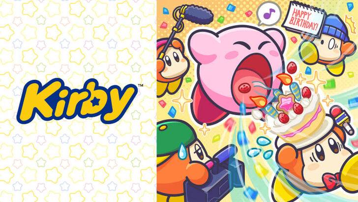
\"Angry Kirby\" Explained by Former Nintendo Employees

Former Nintendo employees have shed light on why Kirby's appearance differs in the U.S. compared to its original Japanese version. Dive into the article to understand why Kirby was marketed differently to Western audiences and learn about Nintendo's global localization strategies.
"Angry Kirby" Was Made To Appeal To Wider Audiences
Nintendo Rebranded Kirby For More Appeal In The West
Kirby's fiercer and tougher appearance on game covers and artworks was designed to resonate more with American audiences, earning the nickname "Angry Kirby" among fans. In a January 16, 2025, interview with Polygon, former Nintendo Localization Director Leslie Swan elaborated on the company's strategy to alter Kirby's look in the West.
Swan clarified that Kirby wasn't meant to look angry but rather determined. She noted, "Cute, sweet characters are popular among people of all ages in Japan." Conversely, she pointed out, "In the U.S., tween and teen boys are often drawn to tougher characters."
Kirby: Triple Deluxe Director Shinya Kumazaki, in a 2014 GameSpot interview, emphasized that the cute version of Kirby attracts more players in Japan, while a "strong, tough Kirby that’s really battling hard" appeals more to U.S. audiences. However, he noted that this varies by title, as seen with Kirby Super Star Ultra, which featured a tough Kirby on both U.S. and Japanese box art. Kumazaki highlighted that while they aimed to showcase Kirby's serious side through gameplay, the character's cuteness remains a significant draw in Japan.
Advertising Kirby As "Super Tuff Pink Puff"
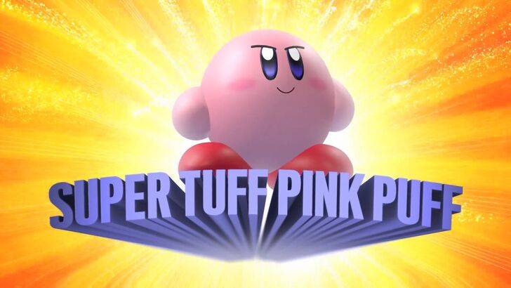
Nintendo's marketing strategy aimed to broaden Kirby's appeal, particularly to boys, by branding him as "Super Tuff Pink Puff" in the 2008 Nintendo DS game Kirby Super Star Ultra. Former Nintendo of America Public Relations Manager Krysta Yang explained that Nintendo sought to shed its "kiddie" image during her early tenure. She remarked, "There was certainly a period of time for Nintendo, and even gaming in general, to have a more adult/cool factor." Yang added, "Having a game that was labeled ‘kiddie’ was really a curse."
Nintendo consciously worked to portray Kirby as tougher and to emphasize the combat elements of its games, distancing the character from being seen solely as a children's icon. In recent years, as seen in promotional materials for Kirby and the Forgotten Land in 2022, the focus has shifted more towards gameplay and abilities rather than Kirby's personality. Yang noted, "There’s been a continued push to make Kirby into a more well-rounded character, but it’s true that most people still regard Kirby as cute versus tough."
Nintendo’s U.S. Localization For Kirby
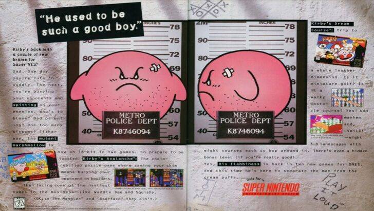
The localization differences for Kirby between Japan and the U.S. began with a notable 1995 print ad featuring Kirby in a mugshot as part of Nintendo’s "Play It Loud" campaign. Over the years, the box art for Kirby's games showcased varying facial expressions, with titles like Kirby: Nightmare in Dream Land in 2002, Kirby Air Ride in 2003, and Kirby: Squeak Squad in 2006 depicting Kirby with sharp eyebrows and a meaner look.
However, Nintendo's adjustments went beyond facial expressions. In 1992, Kirby’s Dreamland was released for the GameBoy, marking the debut of the Kirby series. The U.S. box art for this game portrayed Kirby with a ghostly-white tone, contrasting with the original pink hue in Japan. Due to the GameBoy's monochrome display, U.S. players didn't see Kirby's pink color until Kirby’s Adventure was released on the NES in 1993. Swan explained that this posed a challenge, stating, "A puffy pink character for boys who are trying to be cool just wasn’t going to get the sales that everybody wanted."
This led Nintendo of America to modify Kirby's facial expressions on U.S. box art to appeal to a broader audience. In recent times, Kirby's global advertising has become more consistent, alternating between serious and gleeful expressions.
Nintendo’s Global Approach
Both Swan and Yang agree that Nintendo has adopted a more global perspective in recent years. Nintendo of America now collaborates closely with its Japan office to ensure more consistent marketing and localization strategies. The company is moving away from regional variations, such as those seen in Kirby’s box art, and avoiding scenarios like the 1995 Kirby "Play It Loud" advertisement.
Yang noted that the global audience hasn't changed, but the business strategy has shifted towards more global marketing. She said, "It’s good and bad. Being global means consistency for the brand across all regions, but sometimes there is a disregard for regional differences." She also expressed concern that this could lead "to really bland, safe marketing for some of Nintendo’s products."
Game localizers believe that the current trend of localization, or the lack thereof, is influenced by the industry's globalization and the growing familiarity of Western audiences with Japanese culture, including games, movies, manga, anime, and other media.


- 1 Pokemon GO Fest 2025: Dates, Locations, and Event Details Jan 08,2025
- 2 Pokémon TCG Pocket: Wonder Pick Date, Time, and Promo Cards – February 2025 Mar 03,2025
- 3 How to Get All Ability Outfits in Infinity Nikki Feb 28,2025
- 4 Black Myth: Wukong Tops Steam Charts Days Before its Launch Jan 07,2025
- 5 Ukrainian Internet Stalled as 'S.T.A.L.K.E.R. 2' Release Overwhelms Dec 30,2024
- 6 inZOI, a Korean Sims-Like, Delayed to March 2025 Mar 01,2025
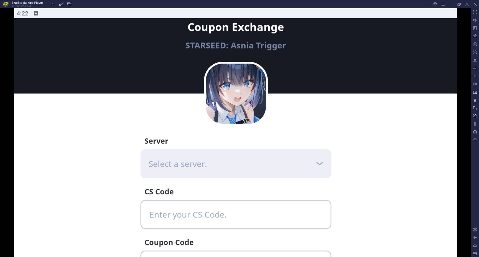
- 7 Starseed Asnia Trigger Codes (January 2025) Mar 06,2025
- 8 Assassin's Creed Shadows Postponed to March 2025 for Enhancements Feb 21,2025


-
Budgeting & Investing: Your Guide to Financial Apps
A total of 9
-
Addictive Hypercasual Games for Quick Play
A total of 10
-
Best Role Playing Games for Android
A total of 10